
Saving money on fancy storage by drilling holes in a piece of wood
I find it hard to function when my workspace is messy, which applies to my email inbox too.
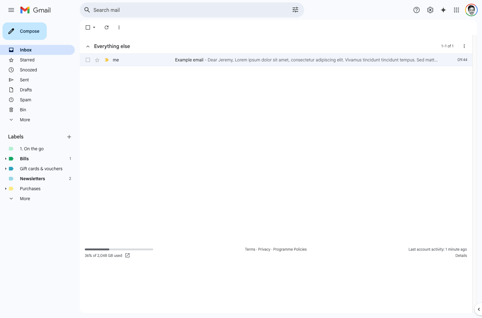
A while ago I found a browser extension that heavily modifies the Gmail inbox to simplify the layout and make it much more pleasant to use, then they did a rug-pull and made it cost money. 🙃
I realised I could just do a basic version myself just with some custom CSS, so I did!
1. Hiding stuff
I basically wanted to remove any visual noise and features I never use so I could focus on my beloved electronic mail.
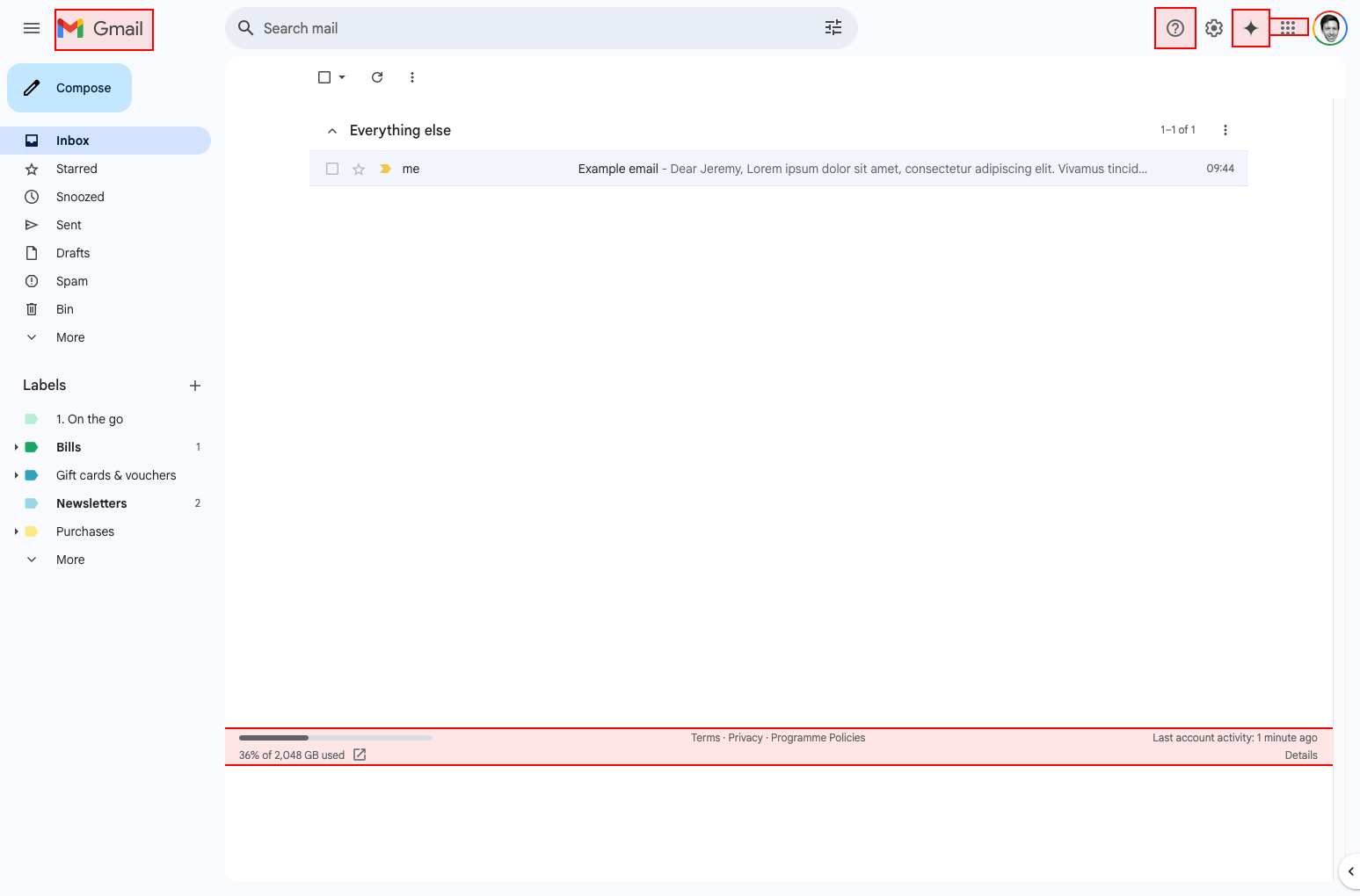
- The Gmail logo - The old browser extension hid this so I thought I'd do it too—I already know where I am.
- Support button - Never used this in my life.
- Gemini button - Perish.
- Google apps button - I go to other apps by opening a new tab, I don't need this.
- Bottom toolbar - None of this is useful to me.
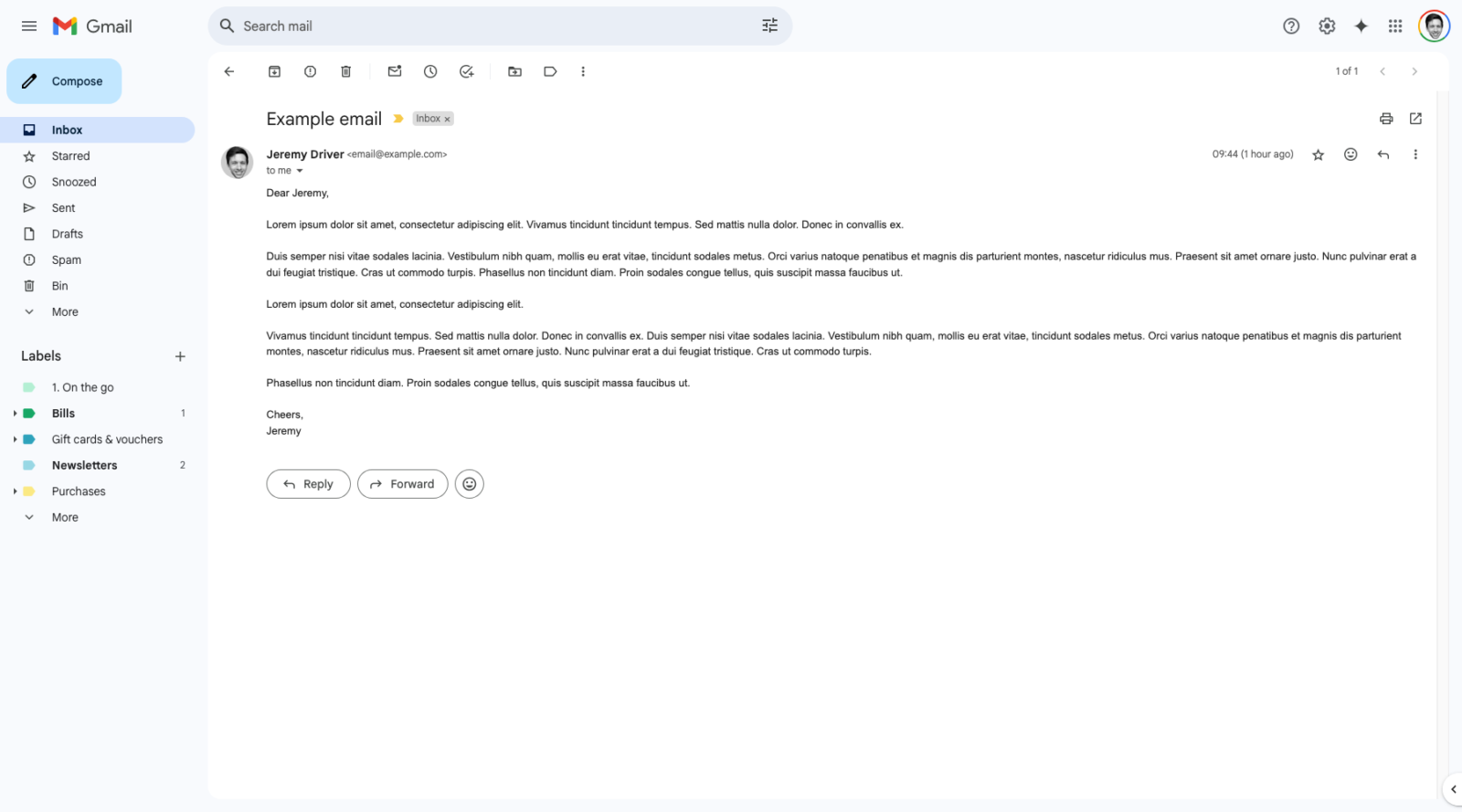
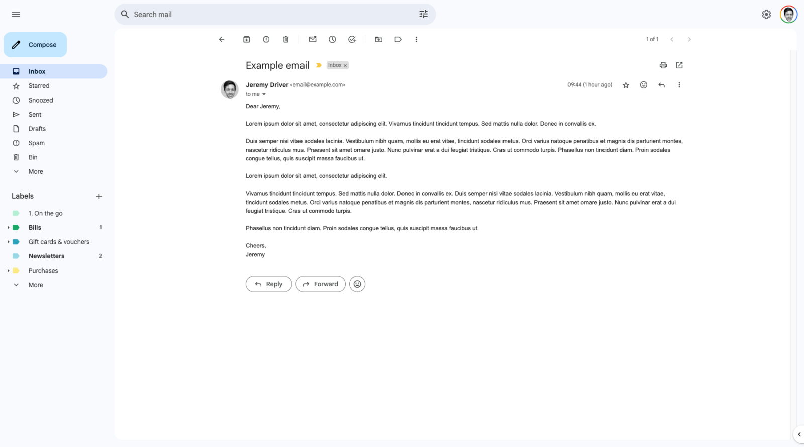
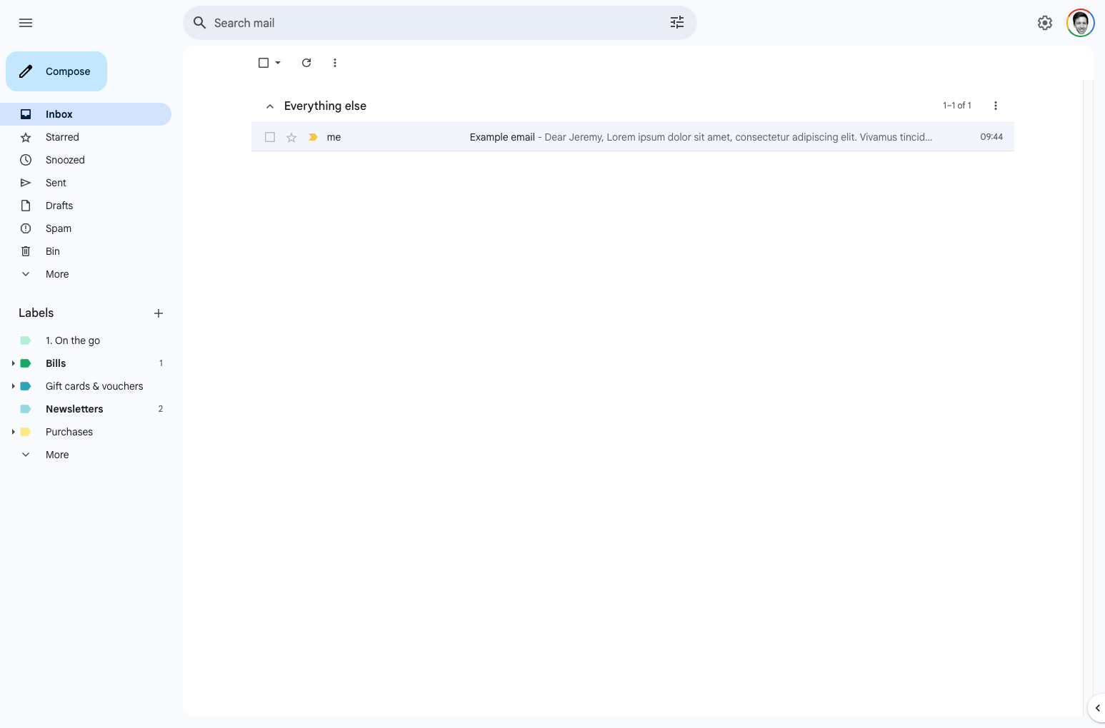
Much nicer to read, especially on a big screen!
/* Hide stuff */
.gb_Dc, /* gmail logo */
.zo, /* support icon */
.gb_4c, /* google apps button */
.e5IPTd, /* Gemini button */
.aeG /* bottom links & info */
{
display: none !important;
}
/* Reading area */
.aeF,
.G-atb {
max-width: 100ch; /* not too wide */
margin-inline: auto !important; /* centred */
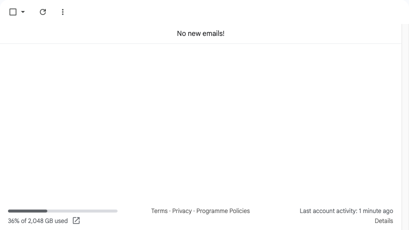
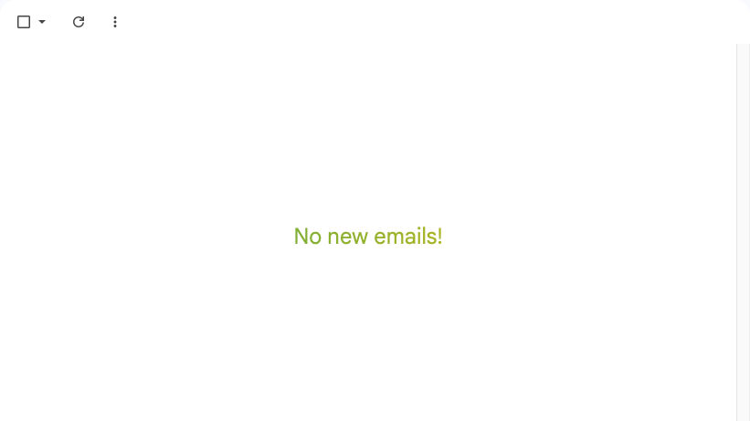
}/* inbox zero */
.TC:not(:empty) {
height:60vh;
position: relative;
border-bottom: 1px solid white; /* no grey border */
font-size: 1.5rem;
color: rgba(234,67,53,1);
background: linear-gradient(90deg, rgba(234,67,53,1) 0%, rgba(66,133,244,1) 33%, rgba(52,168,83,1) 67%, rgba(251,188,5,1) 100%);
-webkit-background-clip: text;
-webkit-text-fill-color: transparent;
background-size: 300%;
background-position: 0% 0%;
animation: bg 5s ease-in-out infinite alternate;
}
@keyframes bg {
from {
background-position: 0% 0%;
}
to {
background-position: 100% 0%;
}
}Annoyingly, because the class names are so cooked (obfuscated and presumably regenerated when they update Gmail) I have to update minimal-gmail.css every now and then. I'll try to keep this post updated too.
How do I apply the CSS?
I use the Stylus browser extension to add custom CSS to any web page.
May all emails find you well
🧹
✨